A route coloured by pace, splits for every kilometre or mile, heart rate, elevation and running form from your watch. Similar runs show whether you are getting faster.
From numbers to a story
A run page in most apps is a table. Runtile's run page tries to answer the question you actually have: was that a good run?
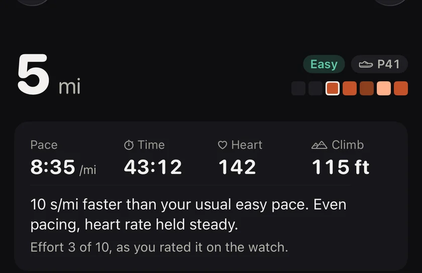
It starts at the top with the distance, big and rounded, then pace, time and heart rate. Then a single sentence: "Negative split, fastest 5 km since March" or "Hard run. An easy day next keeps the balance."
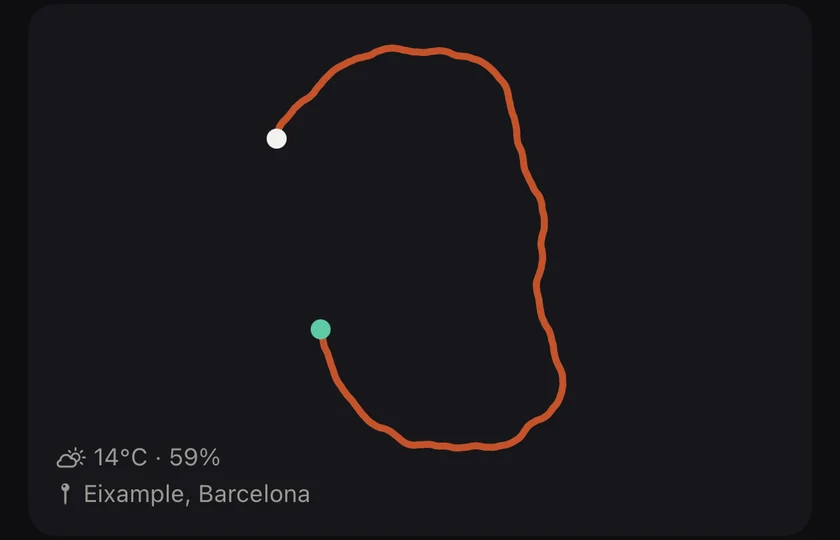
The run, and one sentence about it.Your route, drawn without a map.
The cards
Route. Your GPS track drawn as a path, with a dot that moves as you scrub the timeline. Not a map, just the shape of the run.
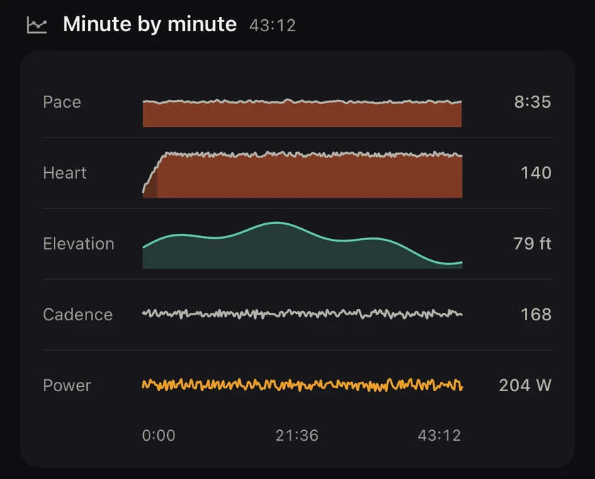
Timeline. Pace, heart rate, elevation, cadence and power on one shared time axis. Drag a finger across it and every card updates to that moment.
Every measure on one timeline you can scrub.
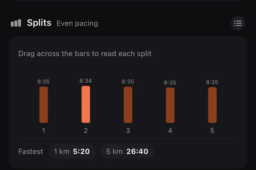
Splits. Each kilometre or mile as a bar, coloured with the same pace scale as the heatmap, with the altitude drawn behind. Even, negative or positive split is named.
Heart rate zones. Time in each of five zones from your maximum heart rate, and a sentence about drift: how much your heart rate rose for the same pace in the second half.
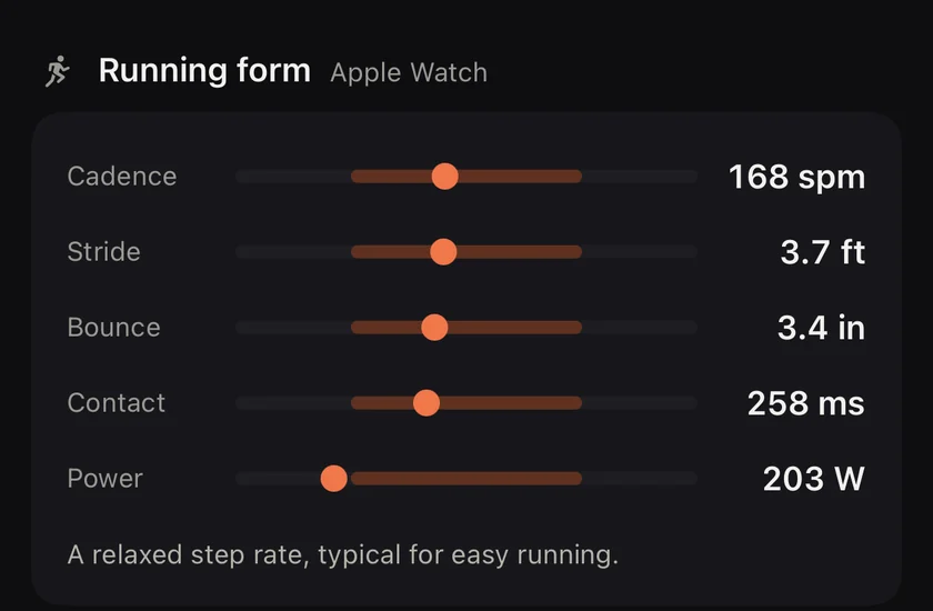
Running form. Cadence, stride length, vertical oscillation, ground contact time and power, each shown as a dot on a typical range with a plain label. No coaching jargon.
Bests in this run. Your fastest 1 km, mile, 5 km, 10 km, half or marathon segment inside this run, and whether any of them was a personal best.
Splits, and your fastest stretches.Running form, each on a typical range.
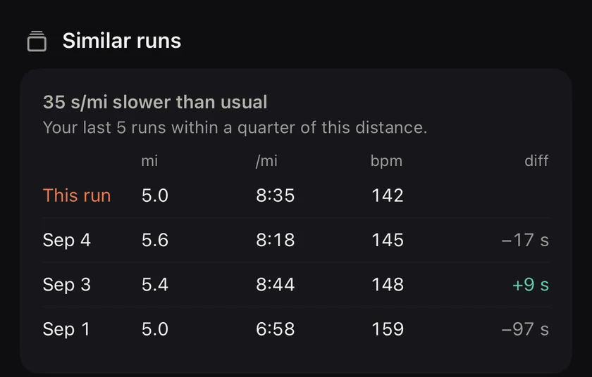
Similar runs: are you getting faster? (Pro)
Similar runs. The last few runs of about the same distance, with the pace and heart rate difference. This is the "was it good for me" card.
Shoes. Which pair you wore. Tap to change. A guessed assignment is marked until you confirm it.
The footer. Elevation, weather when the recording app stored it, source app, max heart rate.
Scrubbing
Put a finger on the timeline and slide. The route dot moves, the splits highlight, the zone bar shows the zone at that moment. It is the fastest way to find out what happened at kilometre 7.
What is free
The whole run page is free for every run, because understanding a single run is where every runner starts. Similar runs, the card that compares this run with your recent runs of the same distance, is part of Runtile Pro.
Questions
Do I need an Apple Watch for the running form metrics?
Cadence, stride length, vertical oscillation, ground contact time and power come from Apple Watch Series 8 or later, or from other watches that write these types to Health. Without them the cards simply do not appear.
Is the route shown on a map?
Runtile draws the route as a line coloured by pace, without map tiles. You still see the shape, the loops and where you slowed. To name the place, only the start and finish points of the run are sent to Apple Maps.
Where does the story sentence come from?
From the run itself. A negative split, a personal best segment, a heart rate drift, a hot day. Runtile picks the one fact that matters most and says it in a line.