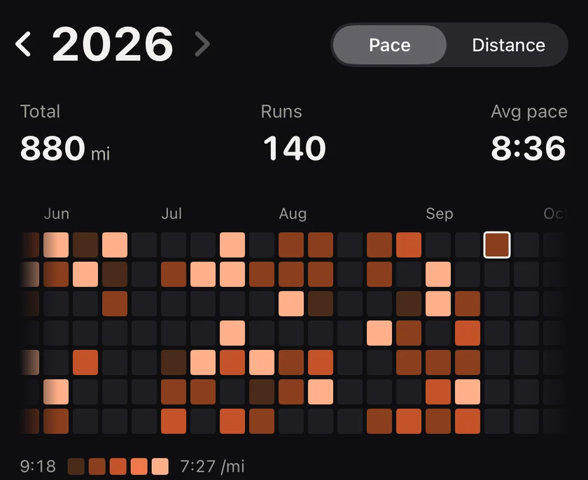
Every day you ran is a tile, coloured by how far or how fast you went, so big days and easy days stand out. Tap any day, check your streaks and look back at every month.
6:11 /km5:18 /km
Why a heatmap
A list of runs tells you what happened. A grid of a year tells you who you are as a runner. The marathon block in spring. The summer you took off. The streak you are on right now. GitHub made the shape famous for code. It suits running even better, because every day is either a run or a rest.
Try it above: hover a tile, then switch between pace and distance.
How the colours work
Pace mode. Runtile takes your runs for the visible year and finds your 10th and 90th percentile pace. Those two values become the ends of a five step scale. Fastest is the brightest coral in dark mode and the deepest coral in light mode. The legend shows the actual paces at each end, so the scale means something for you, not for an average runner.
Distance mode. The same five steps, from a short run to your 90th percentile distance.
Rest days are the quiet empty tile. No guilt, just space.
What you can do
Your year in the app, coloured by pace.
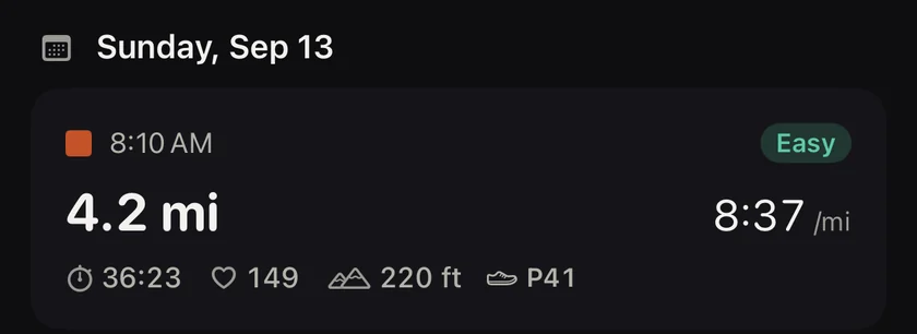
Tap a day to open its runs: time, source app, pace, distance, duration, heart rate, shoes, effort tag.
Swipe between years. Past years are Pro, and they are worth it. Seeing three years side by side is the moment most runners upgrade.
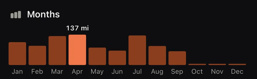
Tap a month for that month's stats behind the grid (Pro).
Tap a day to see its runs.Every month side by side.
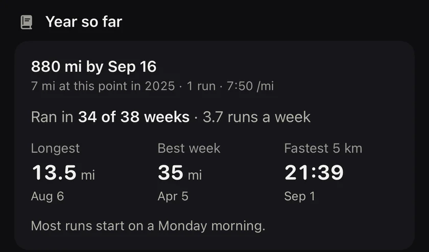
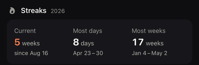
Streaks. A streaks card with your current and longest streak, in run days or run weeks, and how many days of the year you ran.
Share. Render the year, a month or your last run as a card for Instagram or a message. Dark card, tile grid, big number, small Runtile mark.
The year so far, compared with last year.Your streaks for the year.
Small things that matter
Tiles fade in column by column the first time you open the screen. It takes half a second and it is the nicest half second in the app.
Right to left languages keep the grid chronological, left to right, as you would expect.
Indoor runs are included unless you switch them off in Settings.
Questions
What is free and what is Pro?
The heatmap coloured by distance for the current year is free. Colouring by pace, browsing past years, month stats and custom ranges are Pro.
One slow jog with the kids made my whole year look dark. Why not?
The colour scale uses your own 10th and 90th percentile pace, so one very slow or very fast run does not flatten everything else. Runs outside that band get the last colour.
What does the dot on a tile mean?
Two or more runs that day. The tile shows the best pace and the dot tells you there is more inside.